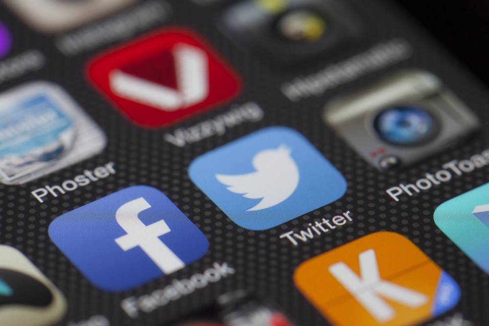
In the crowded world of mobile apps, where thousands vie for attention, your app icon is your digital storefront. It's the first impression potential users have of your app, and it can make or break their decision to download it. This article delves into the fascinating world of app icon design, exploring the importance of aesthetics, usability, and branding in creating icons that captivate and compel users to tap that download button.
The Significance of App Icons
A Visual First Impression
Your app icon is the digital face of your app. It's the first thing users see when browsing app stores. It should be eye-catching and convey your app's purpose or identity at a glance. A good app icon should be simple, yet memorable. It should also be relevant to your app's content and purpose.
Branding and Recognition
A well-designed icon reinforces your brand identity. Think of the Apple logo—a simple apple with a bite taken out. Instantly recognizable. Your app icon should be unique and memorable, and it should help users associate your app with your brand.
Usability and Clarity
Icons must be intuitive. Users should understand the app's functionality just by looking at the icon. Clarity trumps complexity. Your app icon should be easy to understand at a glance, even for users who are not familiar with your app.
Principles of Effective App Icon Design
Simplicity is Key - Keep it Simple
Simple icons are memorable. Avoid clutter, and focus on a single, recognizable element. For example, the Google icon is a simple, multicolored letter "G" that is instantly recognizable to users around the world.
Color Psychology - Harness the power of color
Colors evoke emotions and associations. Choose colors that resonate with your app's purpose and target audience. For example, if your app is about food, you might use colors like red, orange, and yellow to evoke feelings of hunger and excitement.
Consistency - Maintain brand consistency
Ensure your icon aligns with your brand's visual language. Consistency builds trust. For example, if your app has a logo that uses a specific font, color scheme, and style, your icon should reflect those same elements.
Versatility - Think scalability
Your icon should look great in various sizes, from app store thumbnails to home screen icons. For example, your icon should be clear and easy to see even when it is small.
Testing - A/B test your icon
Run A/B tests to find the most effective icon. It's an iterative process. A/B testing is a way to compare two versions of an icon to see which one performs better. You can test different colors, fonts, and styles to see what resonates best with your target audience.
It is important to keep in mind that these are just general guidelines. The best way to create a great app icon is to experiment and find what works best for your app.
Icon Design Best Practices
Know your audience
Research your target audience's preferences and what resonates with them visually. Consider their age, gender, culture, and interests. What are their pain points? What are they looking for in an app?
Iconography
Create icons that tell a story or hint at the app's functionality. Metaphors work well. For example, a house icon could represent a home screen, or a shopping cart icon could represent a checkout process. Make sure the icons are clear and easy to understand, even for users who are not familiar with your app.
Legibility
Avoid intricate details that might become indistinguishable in smaller sizes. Use simple shapes and colors. Test your icons at different sizes to make sure they are still legible.
Uniqueness
Study competitors but strive for a unique, memorable icon. Consider using a different style or format than your competitors. Make sure your icons are visually appealing and reflect the overall style of your app.
Seek feedback
Gather opinions from peers and potential users. Multiple perspectives lead to better designs. Ask people what they think of your icons and what they would change. Use feedback to improve your icons until you are happy with the results.
Following these tips will help you create icons that are effective and user-friendly.
The Psychology of Color
-
Red is a stimulating color that can evoke strong emotions such as passion, excitement, and love. It is often used in marketing and advertising to grab attention and create a sense of urgency. Red is also a good choice for apps that want to convey a sense of energy, excitement, or passion.
-
Blue is a calming and relaxing color that can evoke feelings of trust, loyalty, and peace. It is often used in corporate branding and marketing to create a sense of stability and reliability. Blue is also a good choice for apps that want to convey a sense of trust, security, or calmness.
-
Green is a refreshing and natural color that can evoke feelings of growth, health, and harmony. It is often used in environmental marketing and advertising to promote sustainability and eco-friendly products. Green is also a good choice for apps that want to convey a sense of nature, health, or growth.
Other colors and their meanings include:
-
Yellow: Happiness, optimism, and creativity
-
Orange: Energy, enthusiasm, and creativity
-
Purple: Luxury, royalty, and mystery
-
Pink: Love, romance, and femininity
-
Black: Power, elegance, and mystery
-
White: Purity, innocence, and cleanliness
-
Brown: Earthiness, stability, and reliability
-
Gray: Neutrality, sophistication, and maturity
When choosing colors for your app, it is important to consider the target audience and the desired mood or feeling you want to create.
The Evolution of App Icons
Early Days - Simplicity Reigns
Early app icons were simple and straightforward, reflecting the limited technology of the time. They were often just a single image or symbol, with no text or other embellishments. This was necessary because early mobile devices had small, low-resolution screens, and complex icons would have been difficult to see and understand.
Modern Icons - Aesthetic Sophistication
Today's icons are more sophisticated, leveraging high-resolution displays and advanced design tools. They can be more complex and detailed, and they often include text and other elements to help users understand what they represent. This is important because today's mobile devices have larger, higher-resolution screens, and users expect more from their app icons.
Future Trends - Interactive Icons
The future may bring interactive icons, providing users with dynamic, real-time information. For example, an icon for a weather app might show the current temperature and weather conditions or an icon for a news app might show headlines from the latest news stories. This would allow users to get information at a glance, without having to open the app.
Interactive icons could also be used to provide users with more control over their apps. For example, an icon for a music player might allow users to pause, play, or skip songs without having to open the app. This would make it easier for users to control their apps without having to take their eyes off what they're doing.
Interactive icons are still in their early stages of development, but they have the potential to revolutionize the way we interact with our apps.
Conclusion
Your app's icon is its ambassador, and its design is an art form. Creating a captivating, user-friendly icon is crucial for attracting and retaining users. Remember the principles of simplicity, color psychology, consistency, versatility, and testing to craft an icon that stands out in the competitive app landscape.
FAQs
-
How important is the app icon for user acquisition?
-
Extremely important. A compelling icon can significantly boost downloads.
-
What's the ideal size for an app icon?
-
App store icons vary in size, but a common standard is 1024x1024 pixels. Ensure it looks good in smaller sizes too.
-
Can I change my app icon after launch?
-
Yes, you can update your app's icon with each new release, but consider the impact on branding and user recognition.
-
Do app icons need to follow design trends?
-
While trends can inspire, a unique icon that aligns with your brand may stand out more.
-
Should I hire a professional designer for my app icon?
-
It's highly recommended. Professional designers understand the nuances of icon design and branding.
